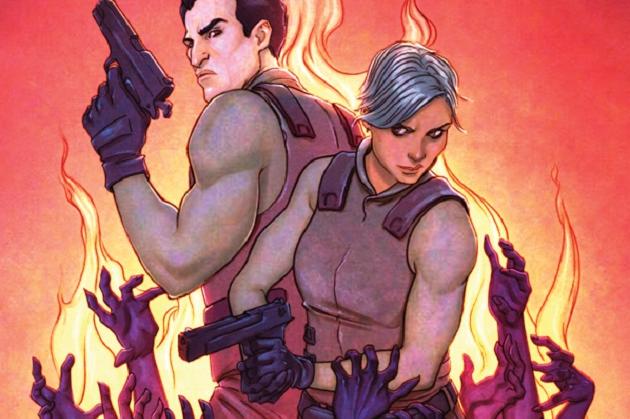
Hellbreak #1
Writer: Cullen Bunn
Artist: Brian Churilla
Publisher: Oni Press
Release Date: March 11, 2015
Cover Price: $1.00
There are thousands of different hells and it seems that with Hellbreak, Bunn and Churilla intend to drag this team of military elites through each one. If every hell is as unique and tense as the one in this initial issue, I’m all for it but the creative team here needs to address a couple things, too.
Bunn scripts an interesting and unique world (or worlds) that has the potential for real, genuine creativity and innovation if done correctly. Like Hellboy, it builds on some real fables and folk lore as far back as Greek mythology and expands on them, shifting their focuses or impacts for a new world. It’s a good concept that, if handled correctly, can parallel our real world but also exist completely in its own. Will each hell have a different lesson? Theme? Tone? Design? I don’t know, but I want to find out and soon. The curiosity the book instills in you even in the first few pages is admirable because good ideas don’t always translate to good stories but here, it’s working. I want to know and see more.
However, for as fresh as the concept is, the characters thus far aren't. The team introduced to us here is bland one. I’m sure they all exist for good reason and their backstories will change how we see them but for now, it’s a stereotypical elite military team who even with the issue in front of me, I can barely tell apart.
Churilla’s art too, is inconsistent, great at times and ill-advised at others. The monsters and set pieces are stellar. That first look back at Hell in the intro segment is something that would have completely sold me on almost anything as a child and still works to great effect here. The characters inhabiting this world however, are less interesting. The military design is bland, tired and cold even. Same too with the inconsistency between the tense, fantastic and horrific elements of the world and the cartoonish take on the character’s faces. It’s not totally off-putting but it does take you out of the world a bit and this a world you don't WANT to be pulled out of.
Ultimately, this is a good first issue but it isn’t a great one. There’s some inconsistencies in both art and storytelling that I can only hope get addressed so that we can more fully enjoy the truly original and exciting concept at the heart of this book.


