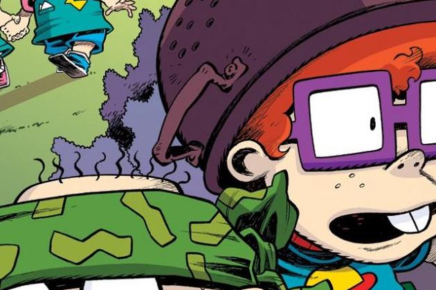
Rugrats #5 Review
Written by Box Brown
Illustrated by Lisa DuBois & Mattia Mi Meo
Colors by Eleonora Bruni
Letters by Jim Campbell
Published by KaBOOM!
I started my review of the last issue saying that Rugrats was on the right track, and I hope it stayed that way. Well, this train derailed, and it may be on the fast track to crashing and burning. If you want a good illustration to the consistency of this series, look at two side by side panels in this issue. Issues 4 and 5 are as unrecognizable to each other as Tommy’s face is from one frame to the other.
The story did pull me in a bit. A lot of the story revolves around Grandpa. Let’s be honest, Grandpa is a kooky old man, something that I think gets lost on an audience of kids. As an adult looking at him, he is a crazy conspiracy theorist. As kid watching the show, well, I think we all just accepted that’s how adults were. And we got sucked into his crazy theories just like Tommy does in this issue.
So, I am really struggling to figure out how I would feel about this issue if the artwork wasn’t so bad—distracting. Would I have enjoyed it? I have to think I would. The story took the Rugrats frame and added to it. The babies’ imaginations always take over when they misunderstand things, and that’s where the entertainment comes from. This issue picked up on that and ran with it. It even included Reptar, a fan favorite.
But, I can’t get over the artwork. It distracted me to the point where I couldn’t enjoy the issue at all. At all at all. A stylistic choice is one thing. Take the secondary story in series like Rick and Morty or Rocko’s Modern Life. They are often drawn stylistically different to separate them from the main stories, which is fine because even though they differ from the original series, they are consistent in those choices. And they keep the elements that make the characters recognizable, even if drawn in a different style. Literally, Tommy will go from having a skinny face to a fat one to looking kinda like the kid in the TV series to being a generic baby whose only shared traits with Tommy Pickles are a blue shirt and bald head.
Also, we don’t need the editor’s notes telling us what word the babies meant to say when they mispronounce something. If kids could figure it out watching TV in the 90s, kids can figure it out while reading a comic book today.
I did like the section where it showed what the babies would look like as different alien incarnations. Jar-Jar Chucky cracked me up. So there’s that.


