FENCE #1
Writer: C.S. Pacat
Illustrator: Johanna the Mad
Colorist: Joana Lafuente
Publisher: BOOM! Box
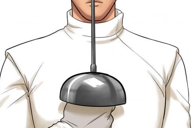
What a strange comic book. It is literally about an amateur fencer who wants to compete in the world of fencing. As I made my way though the pages, the thought couldn’t escape my mind that I had no idea why I was reading this book. Or why this book was even published. Pacat did a fine job of tackling the subject matter and producing a compelling story line, but why? Why fencing? It seems like it would appeal to such a niche market that it hardly seems worth the time or effort.
The plot is the beginning of the typical underdog story that we have all read or seen a thousand times. (Maybe that’s why fencing was chosen, to show an old story translated into a sport that for sure no one has ever seen it in before.) We have the kid with some talent and a lot of heart, the less than stellar trainer, the kid who is a living legend in the field whom our protagonist has no chance of ever defeating . . . does all this sound familiar? It should. However, Pacat does an adequate job of retelling the story in a fresh enough fashion, and it kept me entertained the whole read. Enough suspense is built that the reader should be cheering for the underdog, and any success or failure will have an emotional effect on the reader. The cliffhanger at the end (which we will come back to when discussing the art) was enough to guarantee I pick up the next issue.
The artwork was tame. Mild. Stale. Almost distractingly so. And what a weird thing to be saying about the work of someone who goes by the epithet Johanna the Mad. Maybe the name is a joke. Like calling a three-legged dog Lucky. Plus, the big reveal at the end is almost spoiled because the character is drawn almost unrecognizable to his previous appearances in the book. Or maybe it is just that all the characters look so similar it is hard to differentiate between any of them. Seriously. I spent about three minutes flipping back and forth just trying to make sure the character at the end is a character we’ve seen before, and, to be honest, I’m still not 100% sure based on the art, but it’s the only thing that makes sense in the story.
So, what can I say? It wasn’t bad. It wasn’t all that great either. If you like the underdog story and want to see it in a new context, go ahead and pick this issue up.


